
Thank you for joining the PixelFree family.
The following documentation is intended to help you understand how to navigate and use our software.
Version
1.27.0
Author
Azada Shams
Created
06 January, 2022
Updated
08 April, 2024Creating a Project
After the installation is completed, a new shortcut will be created on your desktop. By clicking on the shortcut, a prompt window will appear with three different options: 'Create New', 'Open Project' and 'Import Figma Project'.
For a new project, select 'Create New'. In the next window, fill in the information about your project. In the text fields under the titles 'Enter Project Name' and 'Enter Document Name', you can define a name for your project and its first page. To specify the location where the project will be saved, you can either choose a path from the dropdown menu or click on the 'browse' button to find the desired folder. Use the 'Project description' option to provide a detailed description of the project.
Click on 'Next' at the bottom right corner to choose the required type of screen between Mobile, Tablet, and Desktop. The default value is always Desktop. In the final step, you can determine the base resolution of the screen by either picking one of the three given options or defining it manually.
Exporting a Project
Click on the generate code button located in the project navigation bar on the top right side. Initially, you have to log in to your PixelFree account or sign up for a new one in order to authenticate with our server. After that, the export window will open, giving you the option to choose between six different languages for designing websites and desktop applications. Select your preferred language along with a destination path for the files, and then click on the blue button, 'Direct Export'. The generated project's files will be saved in the specified folder on your computer. Once the export is complete, you can press the play button directly to start the corresponding local servers.
For Vue, React and Angular there is an Edit-Export button that allows you to define which custom components and variables you want to have.
Importing Figma Project
Project Key
Where can I find the key to my project?
Open the Figma project that you want to import in your browser.
The URL should look something like this:
https://www.figma.com/file/484pQ9uYpeHoZGBRHhqeub/Figma-Basics?type=design
The key is located between the word "file" and your project name, for example:

(Make sure that you enter the key without the leading and following forward slashes.)
This is the key of our example project:
kNBJqlC1WFmFB32KisiqkF
Personal Access Token
How can I get a personal access token?
Open Figma in your browser and log in to an account that has "can view" access to the project you want to import (Figma - Team permissions).
Go to the Account settings.
Scroll down to the "Personal Access Tokens" section.
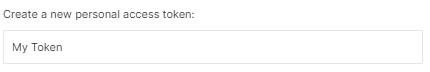
Create a token by entering any desired name in the token description field.
Hit enter, and your new personal access token will be displayed:
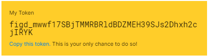
(This will be your only chance to copy the token, so make sure you keep a copy of this in a secure place.)
How to import
To Import Figma Projects into PixelFree Studio, follow the steps bellow:
1. Start the PixelFree Studio app and click on 'Import Figma Project'.
2. Enter your Figma Project Key and Personal Access Token in the next window.
3. Choose the destination for saving your project and click on 'Next' at the bottom right.
4. Select the Frames of your Figma project that you'd like to import by checking the checkboxes above them.
5. Click on 'Import' to start importing your selected Frames into PixelFree Studio.
6. Select the possible target types:
The next window contains three sections. The first column shows a list of all elements of the Figma design.
The second one contains a preview for the selected Figma element at the top and a list of possible PixelFree target types at the bottom.
To transform your design, select an element on the left and its matching target type right next to it.
For example, if you have a text inside a rectangle in your Figma design, you can choose 'Label' as a target type.
If you want to assign the same target type to several elements, hold down 'ctrl' and all following elements will be assigned the same target type as the element before.
The last section is a preview of how the current frame will look in PixelFree Studio. Once the conversion is finished, press 'Import'.
Containers
Anchor Pane
The Anchor Pane serves as a container, anchoring components in their designated positions. Regardless of resizing the Anchor Pane, the elements in it maintain their original placement. It is crucial to remember that an Anchor Pane can expand or get smaller as far as each child component allows it to do so. The position of any component within an Anchor Pane can be specified using the Anchor Pane constraints. The Anchor Pane constraints menu will open at the bottom right of PixelFree Studio once a child component of an Anchor Pane is selected. You can set them to any positive number for each side to anchor the child component within the Anchor Pane.
Important Note: Currently, you must set all Anchor Pane constraints' values manually. We intend to automatically adjust these values in the upcoming release of PixelFree Studio.
Accordion
Accordion is a container that can hold one or more Titled Panes together.
Only one Titled Pane can be expanded at a time. You can add any component to a Titled Pane by simply
dragging and dropping. It is an excellent UI tool for designing items such as FAQs where each Titled
Pane represents a question and its answer.
It is only possible to change the text of the title pane once you have selected the title pane.
Choose from the tabs at the Properties Panel at the right side of the screen,
and you will find the following properties in the ‚Accordion – manage TitlePanes‘ menu:
HBox
HBox is a type of container that arranges its containing objects in a single row. You can drag and drop the control elements, which will then be automatically placed horizontally one after another. This can be used, for example, to create a navigation bar for a website. Choose from the tabs in the Properties Panel on the right side of the screen, and you will find the following properties:
VBox
Unlike HBox, VBox arranges its children into a single column automatically. Choose from the tabs in the Properties Panel on the right side of the screen, and you will find the following properties:
Grid Pane
Grid Pane is a great choice to arrange elements in rows and columns. This container provides a grid where a user can locate elements in cells based on the given horizontal and vertical index values. It is worth mentioning that the size of a cell in a Grid Pane is defined by the largest element in that row/column. You can determine the position of an item in the Grid Pane using the attributes in the Grid Pane constraints, which appears if you click on a child element in the Grid Pane. If you click of the Grid Pane, you can find a Grid Pane gaps tab where you can set a gab between the elements.
The properties are explained below:
- - HGap:Sets the horizontal gap between the elements.
- - VGap: Sets the vertical gap between the elements .
Scroll Pane
Scroll Pane is a container that provides a scrolled and clipped viewport of its content. The Scroll Pane offers a horizontal and vertical scrollbar. Using the scrollbars, you can easily navigate through the available items, such as images in a gallery. Each Scroll Pane contains an Anchor Pane to allow free positioning of its child elements. To customize the design of a Scroll Pane, choose in the Properties Panel on the right side of your screen, and you can find the following attributes:
- - Never: Hides the scrollbar.
- - Always: Keeps the scrollbar visible all the time.
- - As-needed: Adds the scrollbar as the width of the container gets smaller in size.
Flow Pane
Flow Pane is a container capable of arranging its child elements either horizontally or vertically. It resembles HBox when aligned horizontally and VBox in vertical orientation. However, Flow Pane automatically wraps an item to the next row/column if its width/height exceeds that of the container.
It's important to note that if the width/height of the item doesn't fit in the subsequent row/column, it will extend beyond the boundaries of its parent. If an element's height is resized in the horizontal orientation, the other elements will automatically and equally adjust themselves. Likewise, in the vertical orientation, if an item's width is modified, the other components will adapt accordingly.
To change the design of a Flow Pane, select from the tabs in the Properties Panel on the right side of the screen. You will find the following options:
- - horizontal: Arranges the elements horizontally.
- - vertical: Arranges the elements vertically.
Elements
Check Box
The Check Box enables you to select or deselect one or multiple options. When checked, it indicates that the corresponding feature has been chosen. On the contrary, if unchecked, it denotes that the given option is not selected. Check Boxes can be used in different places such as forms, configuration menus, and other contexts. To customize the design of your Check Box, refer to the relevant tabs explained in ‘Properties Panel’.
Radio Button
You can use Radio Button in a context where there is a set of options, and only one of those features must be selected. Unlike Check Box, where you can choose multiple options simultaneously, multiple selections with Radio Buttons cannot be possible. You can use Radio Button to design a survey, preference settings, or forms.
Toggle Button
The Toggle Button allows you to shift between two states/options, an active and an inactive status. For example, you can use it to turn on/off notifications in an application. To customize the design of your Toggle Button, refer to the relevant tabs explained in ‘Properties Panel’.
Dropdown
Dropdown is a compact list of properties among which one can be selected. When you click on this element, it will expand to show the available items to choose from. You can use it to design a navigation menu on a website where some menus have sub-menus. To edit Dropdown Properties’, click on in the Properties Panel, and you will find the following options:
Typography
Paragraph
A Paragraph is used to format and structure a block of text on a website. When you double-click on the Paragraph, you can edit its content, and a format bar will be activated at the top of the window, allowing you to format your text. This bar contains options to style the font, align or indent the text, create lists, or change the text color. Each part of a Paragraph’s content can be styled individually.
Label
You can use a Label as a descriptive text along with other components. It clarifies the purpose of an element, e.g., a Text Field, by providing a title or some instructions right next to it. To edit your label, refer to ‘Labeled Text Properties’.
Media
Image
An Image is useful for inserting visuals into your website/application for different purposes. For example, you can add your company’s logo to a website for a user to identify the existing association. With a double-click on the default image, the file chooser opens. Now you can select an image.
To edit the Image’s properties, click on in the Properties Panel, and you will find the following options:
Video
To enrich your website’s content with multimedia, you can use video along with the text. To edit the Video’s properties, click on in the Properties Panel, and you will find the following options:
SVG
In addition to using Images, you have the facility to import vector graphics to your website/application in PixelFree Studio. To edit the SVG’s properties, click on in the Properties Panel, and you will find the following options:
Carousel
- - Width: Determines the width of both buttons at the right and left sides.
- - Height: Determines the height of both buttons at the right and left sides.
- - Padding: Determines the space around the icon from the edges of the button.
- - Radius: Determines the length of the radius.
- - Left Button Text: Specifies a text for the button at the left side.
- - Right Button Text: If checked, the Carousel will display each image based on the specified Transition Time automatically.
- - Left Button Icon: Selects an icon to be displayed on the button at the left side.
- - Right Button Icon: Selects an icon to be displayed on the button at the right.
- - Background Color: Provides a set of colors for the background color of the Navigation Buttons.
- - Diameter: Determines the radio button’s diameter.
- - Padding: Determines the space between the dot and its background.
- - Background Color: Determines the color of the background of the radio button.
- - Dot Color: Provides a group of colors to choose the dot’s color.
Forms
Text Field
A Text Field can be used to enter text or alphanumeric characters in a Form. For example, it comes in handy for data entry, such as name, address, or e-mail address, while creating an account on a website. To edit the Text Field’s properties, click on in the Properties Panel, and you will find the following options:
Password Field
Password is a type of text field designed to input passwords securely. You can use it in a form, for the purpose of authentication, and create rules for the users to enforce password strength. To edit the Password’s properties, click on in the Properties Panel, and you will find the following options:
Text Area
A Text Area can be used to enter text or alphanumeric characters in a Form. For example, it comes in handy for data entry, such as name, address, or e-mail address, while creating an account on a website. To edit the Text Field’s properties, click on in the Properties Panel, and you will find the following options:
Properties Panel
The Properties Panel is a collection of different tabs used for designing containers and other elements. These tabs adapt automatically according to the corresponding chosen control/layout since each element has a unique design flexibility. Certain properties are designed for specific component types and will be elaborated upon along with the designated element. However, most common properties will be explained in detail to allow you to style each component as you like.
Size Settings
An element’s size can be determined using this property. You can set the values for height and width using the following parameters:
Display Settings
You can use this property to modify the design and position of an element. Click on, and you can find the following options in the ’Display Settings’ tab of the Properties Panel:
- - ADD: Adds the color values of the top and bottom elements.
- - COLOR_BURN: Divides the inverse of the bottom element’s color by the top element’s color, then inverts the result.
- - COLOR_DOGE: Divides the bottom element’s color by the inverse of the top element’s color, then inverts the result.
- - DARKEN: Displays the color of the darker element.
- - DIFFERENCE Subtracts the color of the darker element from the color of the lighter element.
- - EXCLUSION: Multiplies and doubles the colors of both elements, then subtracts the result from the sum of the color components of the bottom element.
- - HARD_LIGHT: Multiplies or screens the colors of both elements based on the color of the top element.
- - LIGHTEN: Displays the color of the lighter element.
- - MULTIPLY: Multiplies the colors of both elements
- - OVERLAY: Multiplies or screens the colors of both elements based on the color of the bottom element.
- - SCREEN: Inverts and multiplies the colors of both elements, then inverts the result.
- - SOFT_LIGHT: Softens or lightens the colors of both elements based on the color of the top element.
- - SRC_ATOP: Fills the overlapping area with the color of the bottom element and the non-overlapping area with the color of the top element.
- - SRC_OVER: Draws the top element over the bottom element.
- - Default: Displays the cursor as an arrow.
- - Crosshair: Displays the cursor as a plus sign used for selection.
- - Hand: Displays the cursor as a hand sign, often used for clickable elements.
- - Move: Displays the cursor as a hook sign that can be used to change the position of an element.
- - E-resize: Indicates the possibility of resizing an element from the right.
- - H-resize: Indicates the possibility of resizing horizontally.
- - NE-resize: Indicates the possibility of resizing an element from the top right.
- - NW-resize: Indicates the possibility of resizing an element from the top left.
- - N-resize: Indicates the possibility of vertical resizing from the top.
- - SE-resize: Indicates the possibility of resizing an element from the bottom right.
- - SW-resize: Indicates the possibility of resizing an element from the bottom left.
- - S-resize: Indicates the possibility of resizing an element vertically from the bottom.
- - W-resize: Indicates the possibility of resizing an element horizontally from the left.
- - V-resize: Indicates the possibility of resizing vertically.
- - Text: Displays the cursor as a capital I, indicating that input can be entered.
- - Wait: Displays the cursor as an animated loop shape, indicating the busy state of an element.
- - INHERIT: The orientation is inherited from the parent.
- - RIGHT_TO_LEFT: Arranges the components from right to left.
- - LEFT_TO_RIGHT: Arranges the components from left to right.
Border Settings
This tab provides two types of borders to be applied around an element: Base Border and Image Border. Click on, and you can find the following options in the ’Border Settings’ tab of the Properties Panel:
Padlock: Displays four different directions: top, bottom, left, and right. The padlock facilitates creating borders with different designs or none for each side by selecting the corresponding direction.
Base Border
Image Border
- - Repeat-x: Repeats the image horizontally.
- - Repeat-y: Repeats the image vertically.
- - No-repeat: Does not repeat the image.
- - Round: Repeats and stretches the image to fill the empty space without clipping.
- - Space: Repeats the image to cover the area in a way that distributes the extra gap around the tiles.
Background
You can change the background of an element using this property. Click on, and you can find the following options in ’Background Settings’ of the Properties Panel:
- - Repeat: Repeats the image as much as possible to fill the area. There are times when the image can get clipped
- - Repeat-x: Repeats the image horizontally at the specified position.
- - Repeat-y: Repeats the image vertically at the specified position.
- - No-repeat: Does not repeat the image.
- - Space: Repeats the image to fill the area without clipping. The extra gap is distributed around the tiles.
- - Space-x, Repeat-y: Combines the properties of Space and Repeat. In the horizontal direction, the image gets repeated with a gap in between the tiles with no clipping. On the contrary, there will be no space in the vertical direction, and the image can get clipped.
- - Repeat-x, Space-y: Similar to Space-x, Repeat-y with the difference that the x and y coordinates are exchanged.
- - Space-x, Round-y: Combines the properties of Space and Round. The image gets repeated as often as possible to cover the area with no clipping. It will be stretched vertically, and there will be a gap in between the fragments horizontally.
- - Round: Repeats the image to fill the area without clipping. The image is resized to fill the empty space.
- - Round-x, Repeat-y: Repeats the image as much as possible applying the properties: Round horizontally and Repeat vertically.
- - Repeat-x, Round-y: Repeats the image as much as possible applying the properties: Repeat horizontally and Round vertically.
- - Round-x, Space-y: If checked, the border will cover the central patch.
- - Auto: Preserves the original size of the image.
- - Cover: Shrinks the image to the smallest size, preserving its aspect ratio.
- - Contain: Expands the image to the largest size, preserving its aspect ratio.
Transformation
You can use the attributes in this panel to apply different types of transformations to an element. Click on , and you can find the following options in the ’Transformations’ tab of the Properties Panel:
Accessibility
PixelFree Studio enables your application to work with external accessibility services. Using this property, your product can provide a better user experience for individuals with visual, auditory, and cognitive impairments. Click on, and you can find the following options in the ’Accessibility Settings’ tab of the Properties Panel:
Text Properties
This panel appears when you click on the controls: Button, Label, Toggle Button, and Dropdown. Click on, and you can find the following options in the ’Labeled Text Properties’ tab of the Properties Panel:
- Determines how to deal with the overflow of the text within an element by displaying a random string. The default value for this string is ... , which can be replaced by any set of characters in the text field under ‘Ellipsis String’.
The position of this string can be determined by selecting one of the following values from the dropdown menu:
- - CENTER_ELLIPSIS: Positions the Ellipsis String in the middle of the text.
- - CENTER_WORD_ELLIPSIS: Positions the Ellipsis String in the middle of the text, ensuring it occurs between full words.
- - CLIP: Hides the overflow.
- - ELLIPSIS: Positions the Ellipsis String at the end of the text.
- - LEADING_ELLIPSIS: Positions the Ellipsis String at the beginning of the text.
- - LEADING_WORD_ELLIPSIS: Positions the Ellipsis String at the beginning of the text, ensuring to remain only full words.
- - WORD_ELLIPSIS: Positions the Ellipsis String at the end of the text, ensuring to remain only full words.
- - Line Spacing: Specifies the vertical distance between two lines of text.
- - Wrap Text: Breaks long words and wraps them to the following line. This property prevents overflow when an unbreakable string is too long to fit in the containing box.
Link
This property is available for the elements: Label, Paragraph, Button, and Toggle Button. Click on, and you can find the following options in the ’Link’ tab of the Properties Panel:
Icon
You can use this setting to choose an image or an SVG as an icon for the components: Button, Toggle Button, and Label. Click on, and you can find the following options in the ’Icon Settings’ tab of the Properties Panel:
Selection
This property is related to the elements: Check Box, Toggle, and Radio Button. Click on, and you can find the following option in the ’Selection’ tab of the Properties Panel:
Form Validation
Form Validation is a property attributed to form the components: Password, Text Field, and Text Area. This property can be used to specify the type of input a component can accept based on the indicated criteria. Click on, and you can find the following options in the ’Form Validations’ tab of the Properties Panel:
Features
Smart Division
Smart Division equips you with responsive web design. This feature allows you to create better quality content for mobile viewing. Follow the steps below to create a fully responsive frontend with our Smart Divisions:
1. To create a Smart Division, click on the Smart Division icon to the right of the gear icon in the property bar.
2. Click on "Add" at the top to create a new Smart Division.
3. Enter any name for the Smart Division and set the width, e.g. 450px.
4. The Smart Division with the default size of your project will be displayed. To make changes to the design of the created Smart Division, you have to select the Smart Division first.
You can create as many Smart Divisions as you like.
If you select 'Auto Select', the design will automatically adapt to the appropriate Smart Division when you change the root size. With 'Auto Snap', the canvas will adapt to the selected Smart Division, i.e. the part behind the line is cut off
Library
It is possible to build and save certain components of your websites in a folder in PixelFree Studio. The components stored in the library can then be reused at a later time in the current project or others. To add a new group to the library, follow the steps below:
1. Right-click on the component and select ‘add to library’ from the menu. (OR use the keyboard shortcuts: Control + G on Windows, or Command + G on Mac). A window will appear on your screen containing the selected item and its sub-components in a list.
2. Choose the elements you want to save by checking the check boxes. (Note: If the parent element is deselected, the child component will become deactivated.)
3. Enter a name for the group of selected elements in the text field. You can also replace this group with an existing one saved in the library by choosing its name from the dropdown menu.
4. Choose a destination folder to save the group and click on "Save".
You can simply reuse the saved group by dragging and dropping it from Library.